Thesaurus
2017
Get Thesaurus at Fuerte Type.
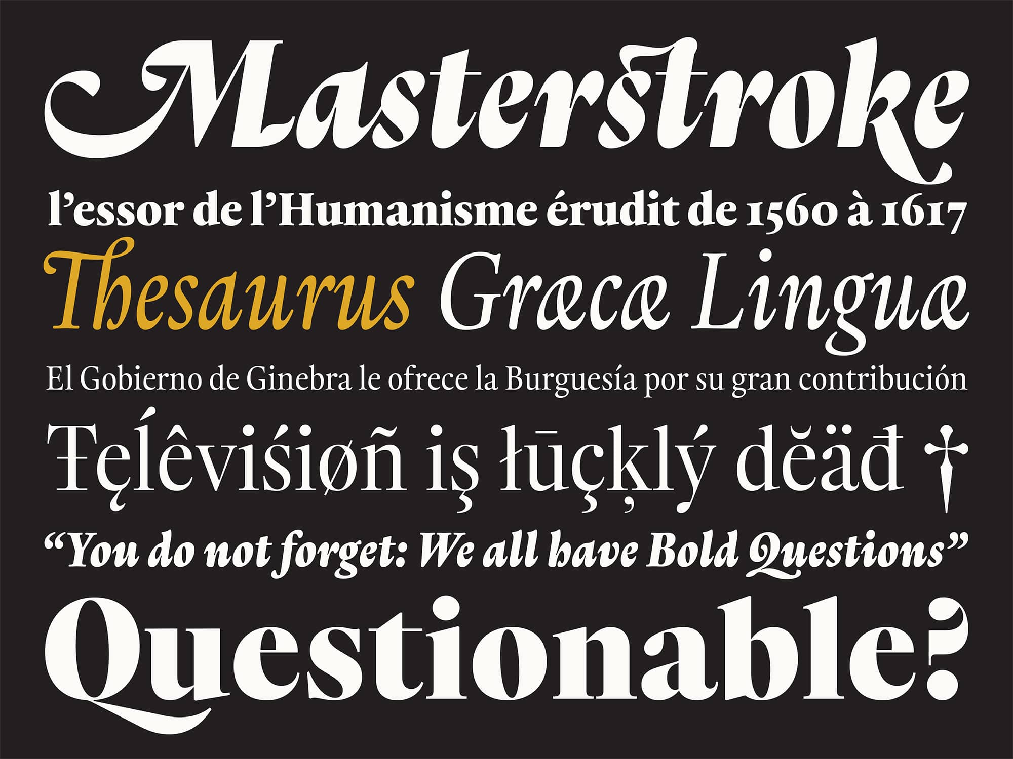
Thesaurus is a super type-family (16 styles) with one foot in the past & one foot in the present which was inspired by the typographic history of the city of Geneva.
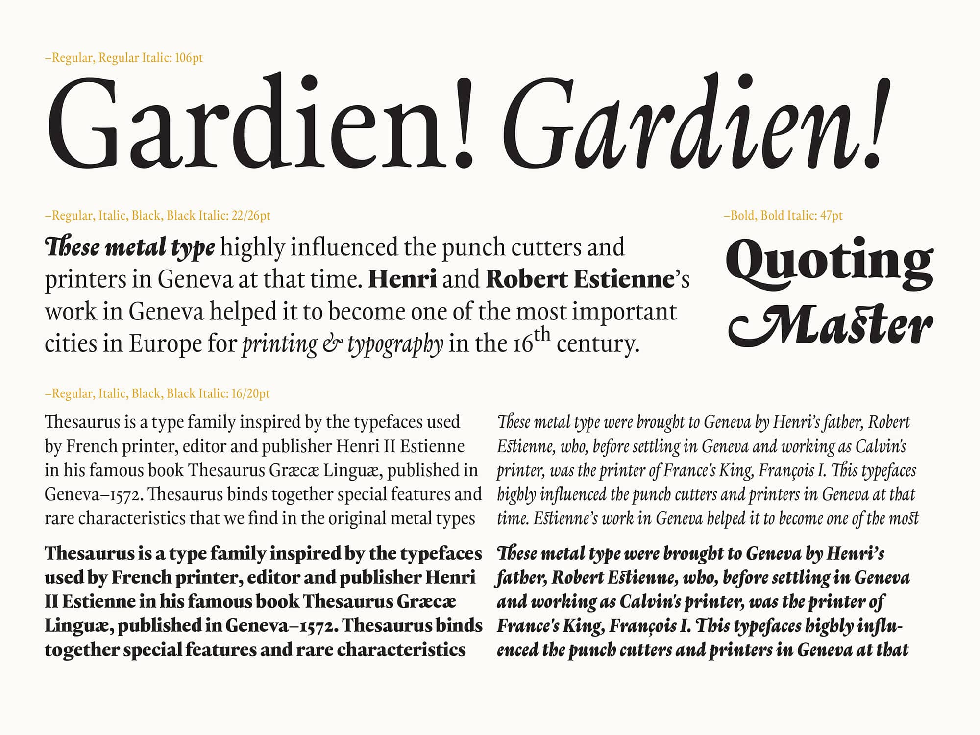
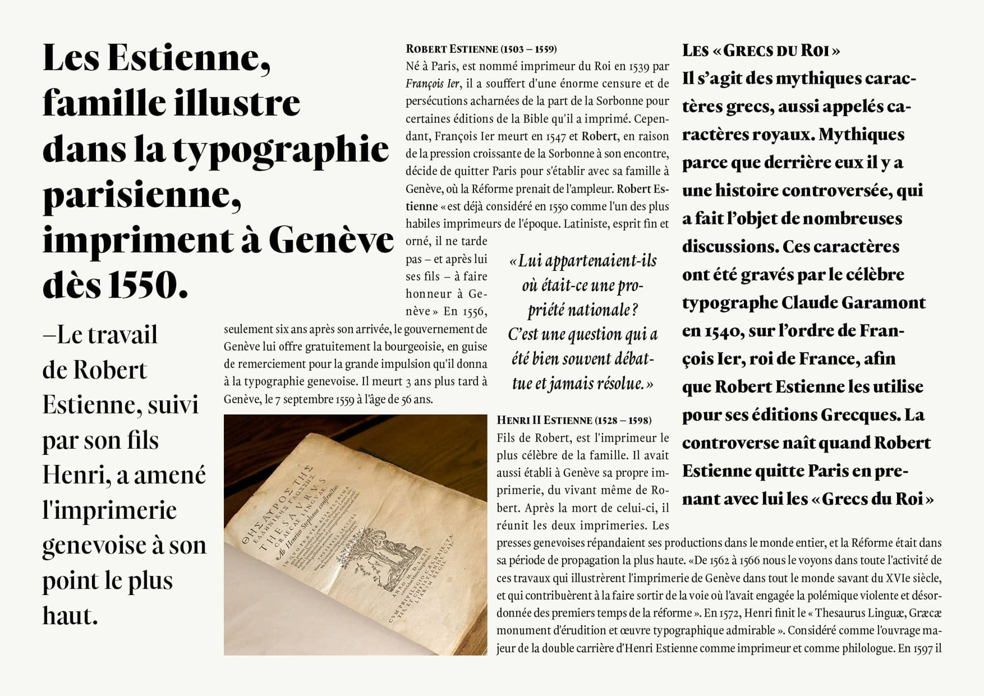
Thesaurus is based on the types that Robert Estienne brought from Paris to Geneva, which were later used by his son Henri II Estienne for printing the famous book "Thesaurus Græcæ Linguæ" in 1572. These metal types served, in some way, as a bridge between France and Switzerland, between Catholicism and Protestantism, and now, through Thesaurus, between past and present.
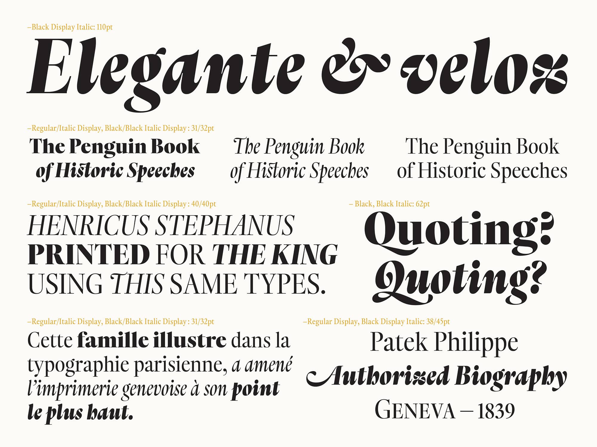
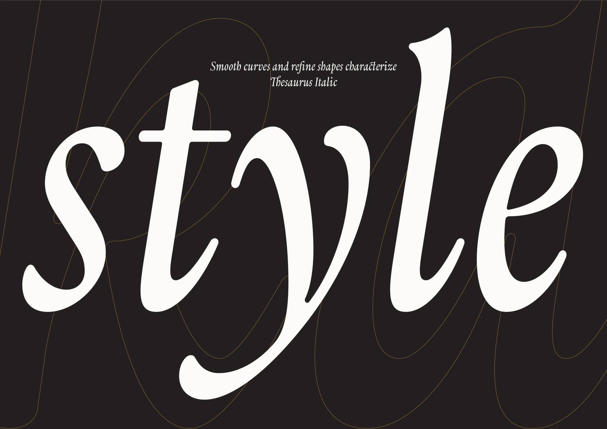
Thesaurus had a first release in January 2017 and was further extended in 2018 adding the Display Italic styles, making Thesaurus sharper and even more dignified. These new styles were developed taking into consideration the feedback I've got from Thesaurus's first users. The creation of the Display Italic styles requested me to rethink many of the original terminations and remove optical compensations designed to enhance small sizes.
Thesaurus has received the Gold award (first prize) at the European Design Awards 2018 and the Gold Award & Best Project of Category at the LAD - Latin American Design Awards 2019. Furthermore, it was one of the 4 projects awarded with the Mention of Excellence at the 8th Latin-American type-design biennial by Tipos Latinos (TL8) – out of 444 projects submitted this year. It was selected in the Superfamily category. It has also been awarded with Gold in the Graphis Type 4: Typeface Design Competition.